
Living Room Lighting Color Temperature: A Clear Choice

After enough evenings spent under lights that made a comfortable room feel harsh, yellow, or strangely gray, I stopped treating color temperature as a minor bulb detail. The Kelvin number changes how paint, wood, upholstery, skin tones, and even the perceived size of a living room look after sunset.
Start With 2700K as the Living Room Baseline
My clear starting point for a normal living room is 2700K warm white. It creates the familiar glow people associate with incandescent lamps, but modern LEDs use far less electricity and produce less heat. For a room used for conversation, television, reading, and relaxing, that warmth usually feels settled rather than clinical.
What 2700K actually changes
Color temperature describes the visual tone of white light, not the amount of light produced. A 2700K bulb does not automatically make a room dim. Brightness comes from lumens, while the Kelvin rating controls whether the light looks warmer or cooler. Two bulbs can both produce 800 lumens while one looks golden and the other looks noticeably white.
Warm light also changes the way surfaces appear. Cream walls look richer, walnut furniture gains depth, and beige upholstery usually looks less washed out. The tradeoff is that blue-gray paint, white marble, and cool silver finishes can pick up a slight yellow cast. That is not a defect; it is the effect of adding warmer light to a cool surface.
Why 3000K is not automatically better
At 3000K, light looks cleaner and less yellow. That can help in a living room with white walls, pale gray furniture, or a lot of daylight. It can also make reading, sewing, sorting paperwork, or inspecting colors easier. My concern is consistency. If the ceiling fixture is 3000K but table lamps are 2700K, the room can look divided into separate color zones.
Choose 2700K when comfort is the main goal. Choose 3000K only when the room has cool finishes or does real work after dark. For most homes, 2700K remains the safest visual baseline.
Use This Kelvin Map for Each Living Room Zone
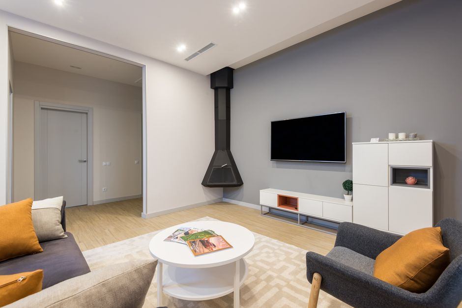
The best living room lighting plan does not assign one number to every fixture by habit. It assigns a range to each job. A ceiling fixture needs to fill the room without making the sofa area feel like a showroom. A reading lamp needs enough clarity for printed text. Accent lighting should support the room’s mood instead of announcing its own color.
| Living room zone | Recommended range | Best visual result | My verdict |
|---|---|---|---|
| Main ceiling fixture | 2700K–3000K | Warm, even general light | Use 2700K for cozy rooms; use 3000K for pale, modern interiors |
| Table and floor lamps | 2700K | Soft pools of light around seating | 2700K is the strongest default |
| Reading corner | 3000K–3500K | Clearer pages and less yellow glare | Use 3000K unless the room already feels cold |
| Wall art or shelving | 2700K–3000K | Warm color with enough detail | Match nearby lamps before adding contrast |
| Media cabinet backlight | 2200K–2700K | Low visual strain near a screen | Stay warm and keep brightness modest |
Do not read the table as a rule that every lamp must match perfectly. The practical goal is to keep neighboring fixtures within about 300K when they illuminate the same sightline. A 2700K lamp beside a 3000K ceiling light often looks fine. A 2200K amber lamp beside a 4000K blue-white downlight looks intentional only when the contrast is carefully controlled.
My Default Pick Is a Warm, Dimmable 2700K Setup
For a relaxed living room, I would buy dimmable 2700K bulbs first and add a separate 3000K reading light only if the room needs sharper task lighting. That combination handles the most common evening activities without making the whole space feel overlit.
The bulb specifications that matter
Look for 800 lumens for a standard 60-watt replacement, a color-rendering index of at least 90, and a dimming label that matches your wall control. CRI matters because two bulbs with the same Kelvin rating can show reds, wood tones, and fabric colors very differently. A cheap bulb with a poor color rating can make a carefully decorated room look flat.
Three familiar examples show the range. The GE Relax 60W LED typically costs about $12 to $15 for a multipack, produces roughly 800 lumens, and uses a warm 2700K tone. The Feit Electric Enhance 60W LED is commonly around $7 to $10 per bulb, runs near 3000K, and is known for high color rendering, making it a better choice for a reading corner or a room with pale finishes. The Philips Hue White Ambiance A19 usually costs about $25 per bulb and allows a much wider adjustable range, roughly 2200K to 6500K, but I would not pay that premium for every socket.
Where the premium bulb earns its price
The Philips Hue option makes sense when one room serves several purposes and you genuinely want to shift from a warm movie setting to a clearer daytime setting. It is wasteful when you only want a steady warm glow. For a basic living room, the GE Relax 2700K is the value pick. For a bright reading area, the Feit Electric 3000K is the better choice. For flexible scenes and connected controls, Philips Hue wins.
Match Fixtures Before You Start Chasing the Perfect Number
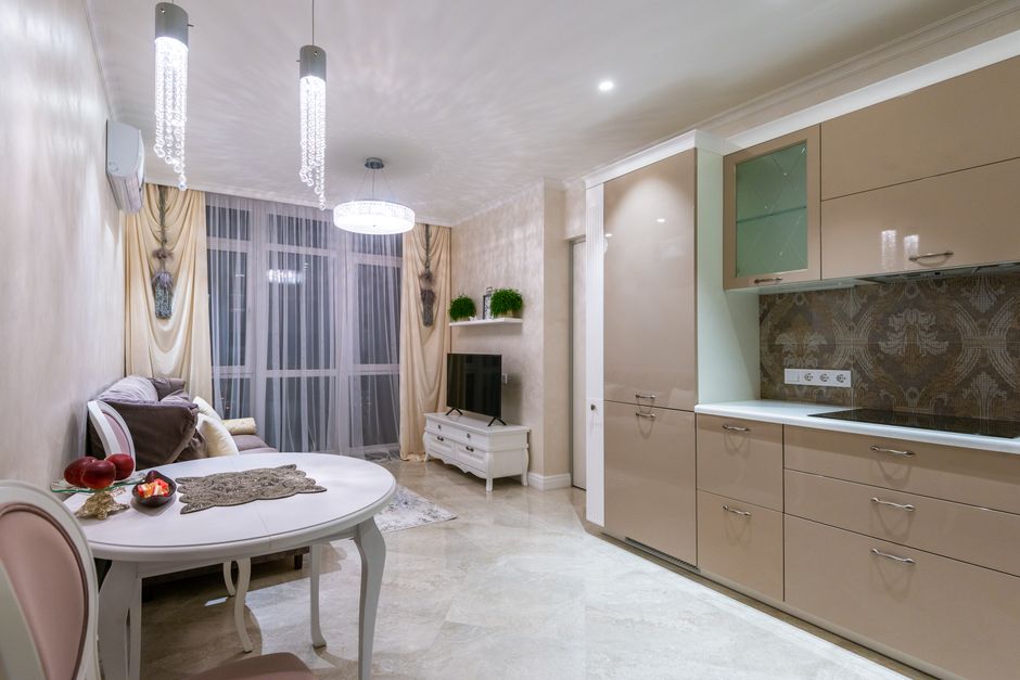
Color temperature problems usually come from mismatched fixtures, not from choosing 2800K instead of 2700K. I use a simple setup process that prevents most expensive-looking mistakes.
- List every light visible from the sofa. Include ceiling fixtures, lamps, wall sconces, cabinet lighting, and decorative bulbs. A hidden lamp still affects the room if its glow reaches the walls.
- Choose the main visual temperature first. Set the ceiling light or largest lamp at 2700K or 3000K. Do not begin with an accent strip because accent light should support the room’s main tone.
- Keep nearby fixtures within 300K. A 2700K floor lamp and a 3000K ceiling fixture usually blend. A 2700K lamp next to a 4000K spotlight will look sharply different.
- Check the room after dark. Daylight hides color problems. Turn off the natural light, sit in the main seating position, and inspect the walls, curtains, floor, and faces.
- Test brightness before changing temperature. A bulb that feels harsh may simply be too bright. Try a dimmer or a lower-lumen bulb before moving from 2700K to a cooler color.
- Keep the same temperature in replacement bulbs. Write the Kelvin rating on a small label inside the fixture or save the bulb model in your phone. Guessing months later is how mixed lighting starts.
The key is to adjust one variable at a time. If you replace a 2700K bulb with a 3500K bulb and double the lumens at the same time, you will not know which change caused the room to feel wrong.
When Does 3000K Beat 2700K?
Is 3000K better for a modern living room?
Yes, when the room has bright white walls, cool gray furniture, polished concrete, or a large amount of blue daylight. The slightly cleaner tone keeps those surfaces from looking yellow. My verdict is 3000K for a modern room that already feels crisp and open, especially when the ceiling fixture is the main source of light.
Should a small living room use cooler light?
Not automatically. A cooler bulb can make details look sharper, but it does not physically make the room larger. In a small room with warm wood, tan fabric, or low ceilings, 2700K usually feels more comfortable. Use brighter lumens, lighter lampshades, and light directed toward the walls if the space needs to feel more open.
When should I choose 3500K?
Choose 3500K for a dedicated task zone, not as the default for the entire living room. It works above a craft table, beside a desk, or in a reading chair where color clarity matters more than softness. I would not use 3500K across a lounge with a television and several warm lamps because the room will start to feel like a workspace.
Avoid These Color-Temperature Mistakes
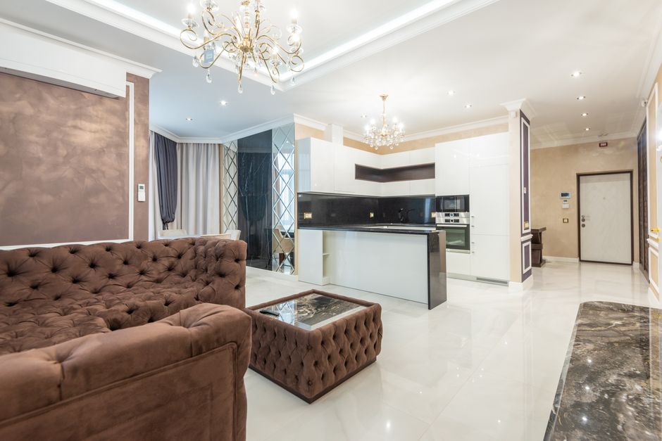
The most common failure is buying bulbs by wattage alone. Wattage tells you how much electricity a bulb uses; it does not tell you how warm, bright, or accurate the light will look. Check lumens, Kelvin, CRI, and dimmer compatibility before the price.
Mixing warm and cool light in one sightline
A warm lamp beside a cool ceiling spotlight can make one wall look cream and another look gray. If the contrast is not deliberate, replace the odd bulb first rather than replacing every fixture. The cheapest fix is often the one bulb that does not match.
Using very warm bulbs everywhere
Bulbs near 2200K can look beautiful in a decorative pendant or behind a media console, but they can make white walls look tan and reading areas look muddy. Use them as accents, not as the room’s only light source.
Ignoring dimming and color quality
Some LEDs flicker, buzz, or shift color when paired with an incompatible dimmer. Others claim to be 2700K but render reds and wood tones poorly. Buy one bulb first, test it at full and low brightness, and inspect it beside the materials in your room.
For a living room I want to enjoy for years, the winning formula is simple: 2700K for comfort, 3000K for focused clarity, high CRI for honest color, and consistent temperatures across neighboring fixtures. LED lighting is becoming more adjustable, but the best result still comes from choosing a calm baseline before adding clever features.